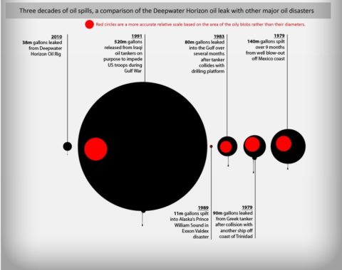
How does the ongoing saga of the BP oil leak in the Gulf of Mexico following the Deepwater Horizon disaster compare with three decades of major oil spills. An infographic from the oil spill timeline page of Iglu Cruises provides a visual comparison using data apparently sourced from the BBC.

Unfortunately, the Iglu graphic somewhat distorts the relative size of the figures. Those oily blobs are scaled by diameter rather than area, so what looks like a huge difference between the recent Gulf leak and Saddam’s deliberate spillage is not quite as enormous as it appears if you assume the relationship is about area of the oily blobs. My apologies for republishing this without making this clear in the initial blog post. I’ve now add red circles that show the actual relative size of each oil spill based on the area of the circles rather than their diameter, which is the more usual way of representing such statistics.
The complete infographic also shows some aspects of the human and environmental impact as well as the variance in the flow rate of oil from the well according to BP and independent observers. I’m disinclined to critique the rest of it given the dubious oily blobs.
Cosmic Variance mentioned this.
UPDATE: Kevin Zelnio has written a critique of the state of oil spills and published a bar chart covering the last fifty years.